FORM: I think the form and the shape of this logo is very simple, therefore really eye catching. You can take a look at it and immediately see what the name of the brand/company is.
LINE: The font is very round, just like the circle itself, which makes it go together very well.
CONTRAST: White always goes perfectly on black, it makes the text pop out, just like in the logo. There are no other colors used, just black and white. Making it, once again, very simple.
MEANING: The logo doesn't have a specific meaning as it is just the company name in a circle, and it has no features where you would have to really figure something out. It's just plain, simple, with the text.
FORM: The font isn't a stock font, which makes it very special and unique. The letters have been extended in order to create the beard shape.
LINE: The font has been made very curly and long to create a beard shape, and not just the extended parts are curled, but also the text itself has been curled making it very obvious that its a beard.
CONTRAST: The fact that it's black and white really makes the word BEARDS stand out and pop out.
MEANING: The logo is really obvious and well thought out and used text and font in a really great way. The word 'BEARDS' represents the beard on the mans face giving it a very funny look. I feel like it was really hard to create this as you have to create or choose the perfect font to make those curves and really get the message across.
FORM: The name of the website is the Verge, therefore they create this V shape. Though, this is also a very common shape, also known as the impossible triangle.
LINE: The lines create a V and an impossible triangle. I believe it looks very artistic and unique.
CONTRAST: The colors in this logo are very bright, though, there's also grey, making it very subtle. The red represents the V of the word Verge.
MEANING: The website is based around technology, and I believe that it really fits the impossible triangle, as technology can be very complicated.
 PROCESS
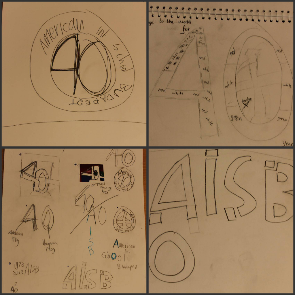


